Design Advice for 2019
Spring is here and you may find yourself looking around thinking it’s time for some home improvements! Whether you’re considering making some upgrades with the intent to sell or you just want to make some changes for your own enjoyment, we’ve got the answers for you!
We’ve been working with Harrison Fae to stage all of our listings for the past 5 years and decided to ask them for their design advice for 2019 – here’s what they had to say:
WALLS
Q. We all know that fresh paint goes a long way! What’s your favourite and most versatile paint colour right now?
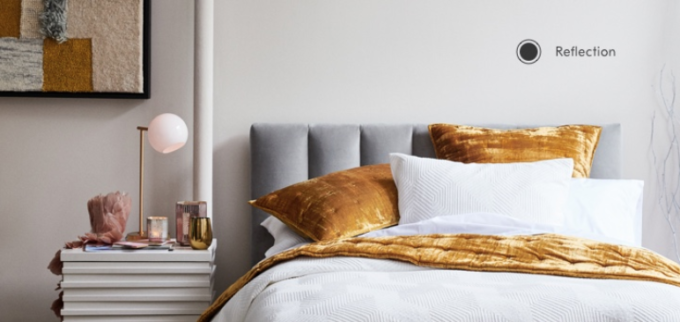
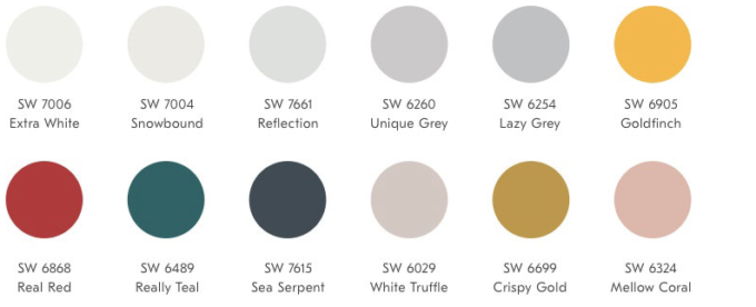
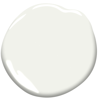
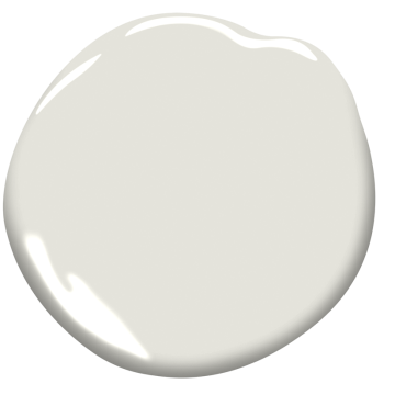
HF “A nice crisp white is our favourite right now. Benjamin Moore CC-30 Oxford White is our favorite. We love to keep the pallet white and then accent with colourful pillows, drapery and art. If stark white is too crisp for you, OC-26 Silver Satin is also a great colour.”
Q. Let’s say someone wanted to do something a bit more bold for an accent wall? What paint colour would you recommend?
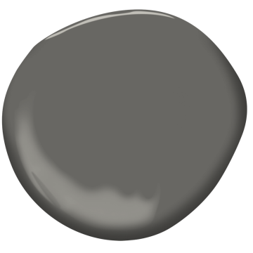
HF “I like keeping accent walls neutral, still meaning a grey or taupe. You won’t get sick of it and you can still accent with great art. HC-166 Kendall Charcoal is my favorite. It is bold and dramatic.”
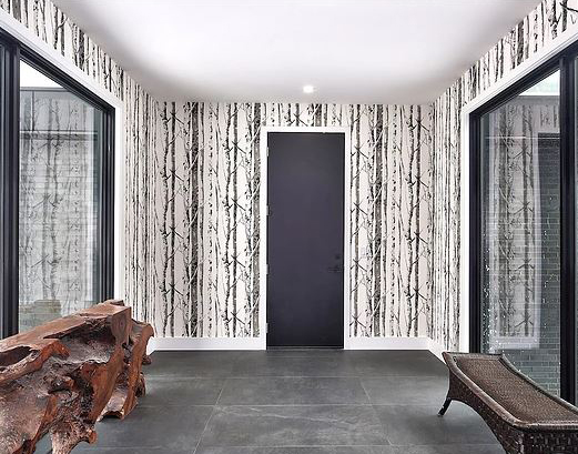
Q. What about wallpaper? Are you a fan? Are there certain rooms where it works better than others?
HF “YES! I would wallpaper every wall if I could. I love to do wallpaper in powder rooms because you can be more bold. I also love to do accent walls in wallpaper like behind a bed or a wall in a dining room. If a client is bold enough to do an entire bedroom or an entire dining room it always makes me happy.”
FLOORS
Q. Everyone loves hardwood! What colour are you currently recommending that’s in style now and will continue to be a fan favourite for the future?
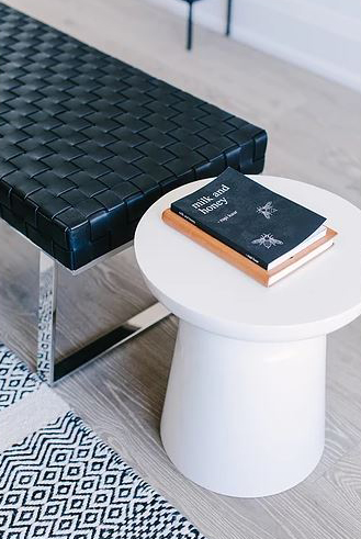
HF “Light hardwood is coming onto the scene and we love it. It is not only light but it is matte as well. This means that it doesn’t show scratches and it hides dust and dirt as well so it’s a double win to me.”
Q. What about in a bathroom? What’s your favourite flooring option?
HF “I will always love natural stone. I don’t think you can get more beautiful than that. It is definitely a more porous option though, so if you want something durable that is low maintenance then a porcelain tile is the way to go. It is very durable and won’t get marked over time.”
Designer Tip: Be sure to get a through body porcelain which means the colour goes all the way through and is not a top glazing. This helps if you ever chip or crack your tile as it will be less visible.
KITCHENS
Q. We love a countertop that pops! What’s the best option in your opinion?
HF “Everyone is going for a Quartz countertop now which is man made and very durable. There is a new product on the market which is thin porcelain slabs. They look just like marble but they are indestructible which everyone likes. They are thin too so they are easy for the fabricators to work with. Laminam is my favourite due to how real it looks.”
Q. We see a lot of different styles and colours for kitchen cabinets these days. What’s your favourite style and colour? How do you feel about different coloured cabinets for lowers and uppers?
HF “Just like our wall colour, I like CC-30 Oxford White. I think having a light kitchen is very timeless and will always be in style. Two toned cabinets are nice but be sure you are keeping it neutral and not going with a trend to avoid being disappointed in a few years. A kitchen is a big item so keeping it neutral will ensure you love it for years to come.”
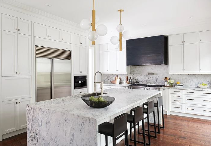
Q. We’ve seen a huge improvement in kitchens simply by upgrading the backsplash. Do you have a preference for kitchen backsplashes that make a statement?
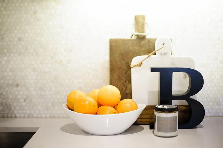
HF “We do a lot of slab backsplashes where you take the countertop right up the backsplash. This looks high end and clean. My other favorite is using a slightly patterned tile. It gives some depth and is less expensive than slab.”
WASHROOMS
Q. From flooring to vanities, to showers and tubs, there are so many ways to make a washroom feel like a relaxing space. Where do you see the most impactful changes if someone wants to renovate or update their washroom?
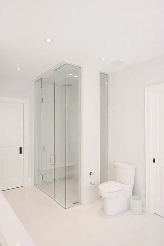
HF “Updating the tile, shower and paint are always a great update. If you don’t have a huge budget, try maintaining your existing vanity and maybe paint it white. If you re-do the tiles it will make a big impact, as well as adding glass to a shower or a tub-shower combo. Painting the bathroom a light colour will give you a nice spa like vibe.”
DÉCOR
Q. Where are your go-to places for all the pieces that make a house a home? We’re talking light fixtures, window coverings, pillows, coffee table books and more!
HF “Our go-to store in Toronto is Elte. They have everything one could want to create their dream home. For drapery we go to My Shades. They can do anything from roller blinds to custom fabric drapery to all pillows, bench seats, upholstered items etc.”
OUTDOORS
Q. With warm weather just around the corner, lots of people are starting to think about ways to bring the indoors outdoors. Do you have any suggestions for making an outdoor space the place to be this summer?
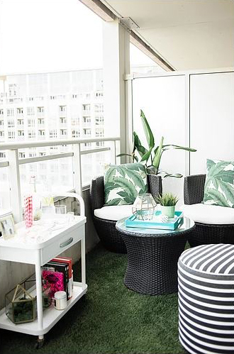
HF “Outdoor spaces are my favourite. Gone are the days of wicker furniture that was “outdoor only” a lot of outdoor furniture looks like living room furniture now and really makes the outdoor patio feel like part of the house. Cozy, inviting and relaxing. Again, keep the pallet neutral and bring in fun colours with area carpets, pillows and inexpensive side chairs. Also, bring lighting in. Stringing lights over the whole lounge area or dining area can create a nice atmosphere for entertaining.”
Thank you so much to Alicia Sass, Founder of Harrison Fae Design for your design tips of the year!
If you’d like to learn more about Harrison Fae or book a consultation with them to ensure that your design plan is executed perfectly, you can view their website and get their contact info HERE.
If you’re considering selling your home, we wanted to give you a friendly reminder that we work exclusively with Harrison Fae to stage all of our listings and we offer industry leading complimentary staging to all of our clients.
Want to check out our before and after staging gallery? Click HERE.
Curious to know how much your home is worth or want to learn more about our listing process? Give us a call at 416.465.7850 or send us an email at info@rosswebpro.com

